
Stylish Handles: The Key to Modern Kitchen Ironmongery
May 15, 2025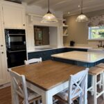
Handmade Kitchens tailored to your space
October 7, 2025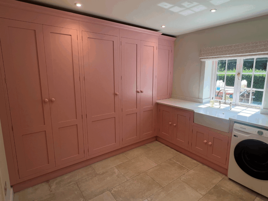
Popular Colour Palettes for Modern Kitchens
Colour choices play a significant role in shaping the overall atmosphere and functionality of a kitchen. With the kitchen being a central hub in many homes, selecting the right palette is an important consideration, balancing aesthetics with practicality.
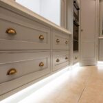
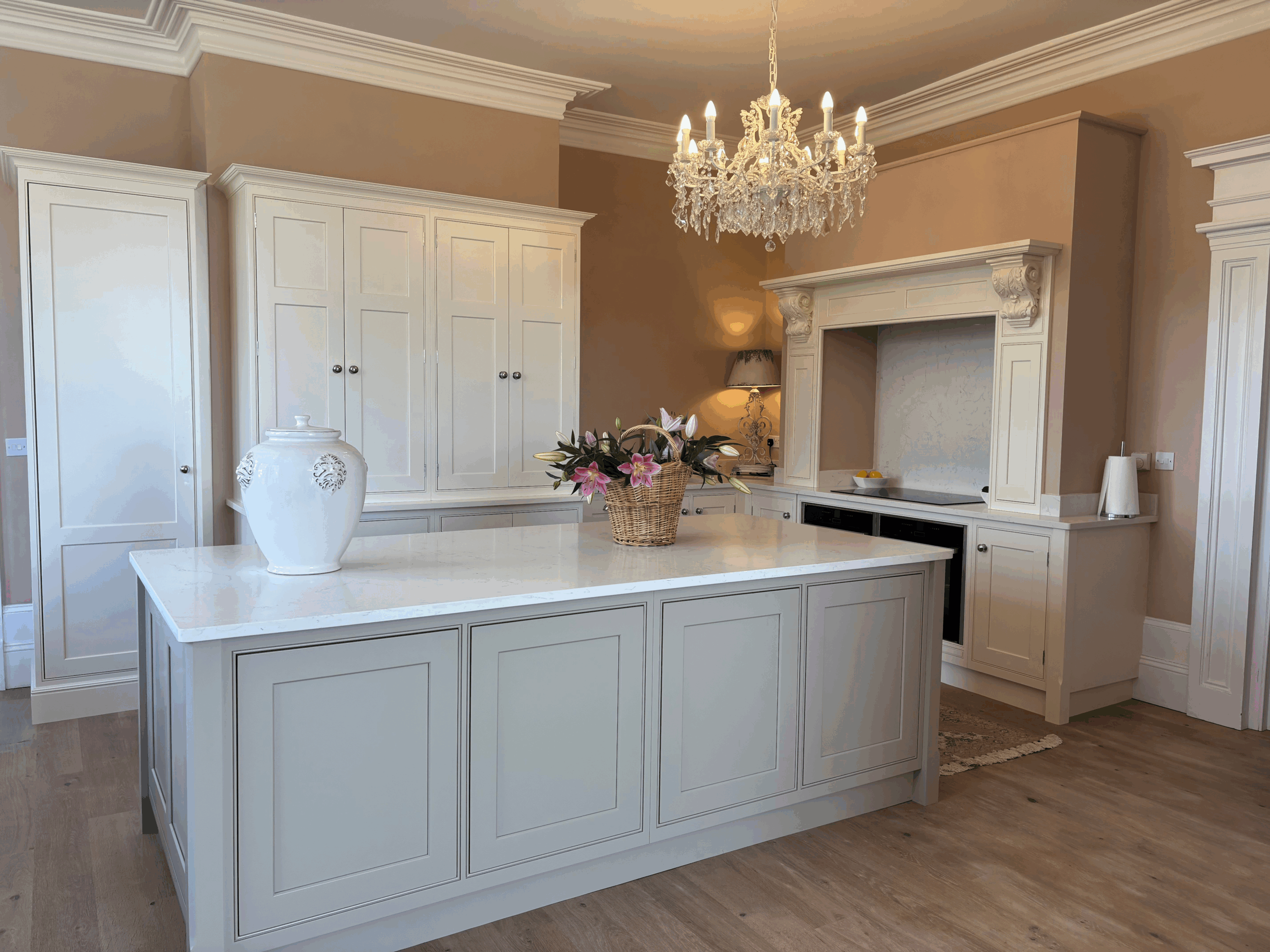
Neutral colours remain a staple in kitchen design for their timeless appeal and adaptability. Shades such as white, cream, and soft grey can provide a subtle yet sophisticated look. These tones are particularly effective for creating a bright and open feel, making them ideal for spaces with limited natural light. Pairing neutral colours with natural materials, like wood or stone, adds warmth and texture, resulting in a harmonious and understated design.
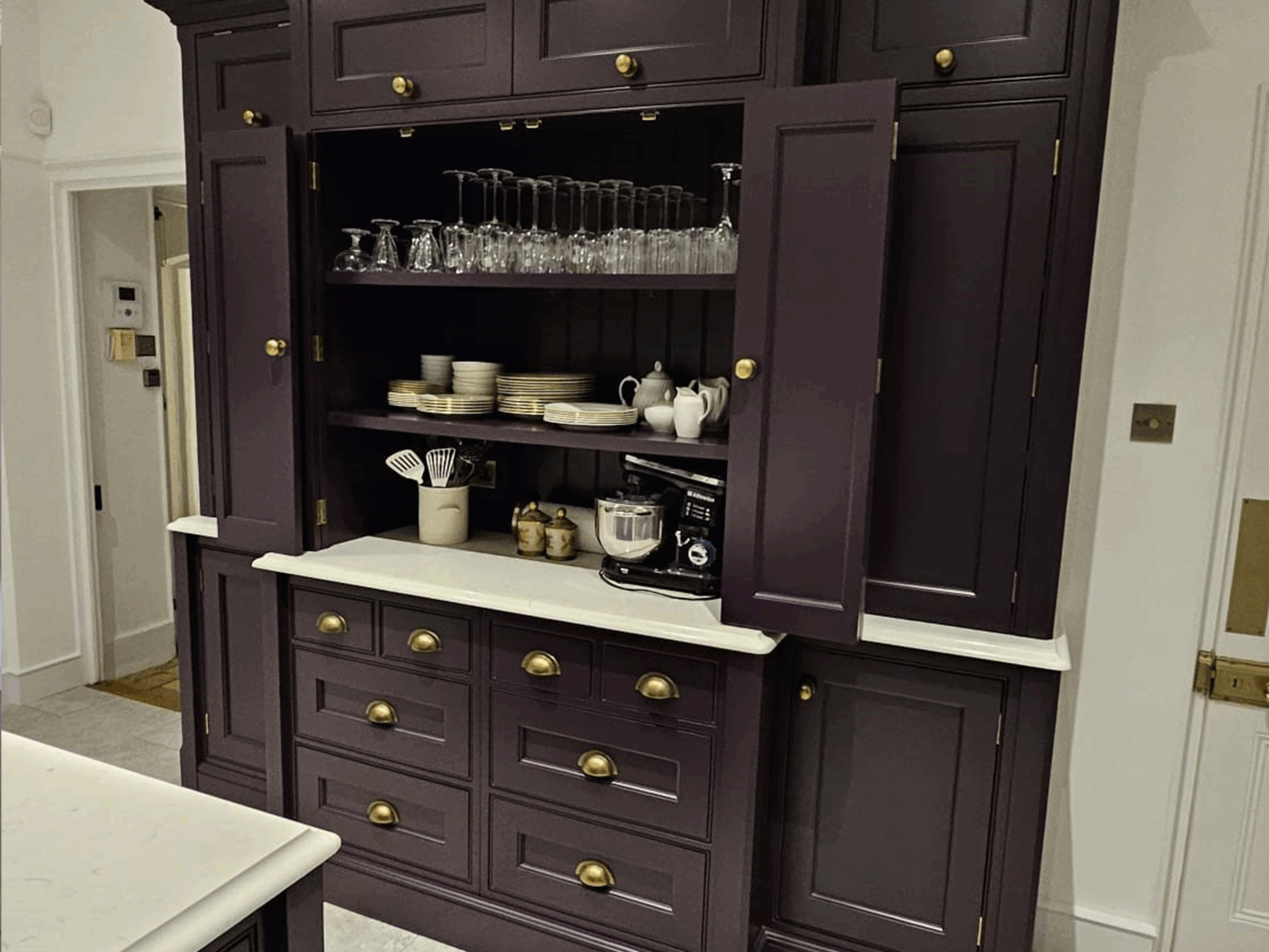
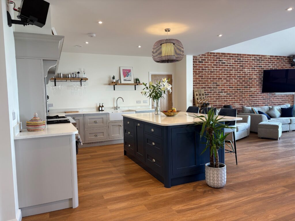
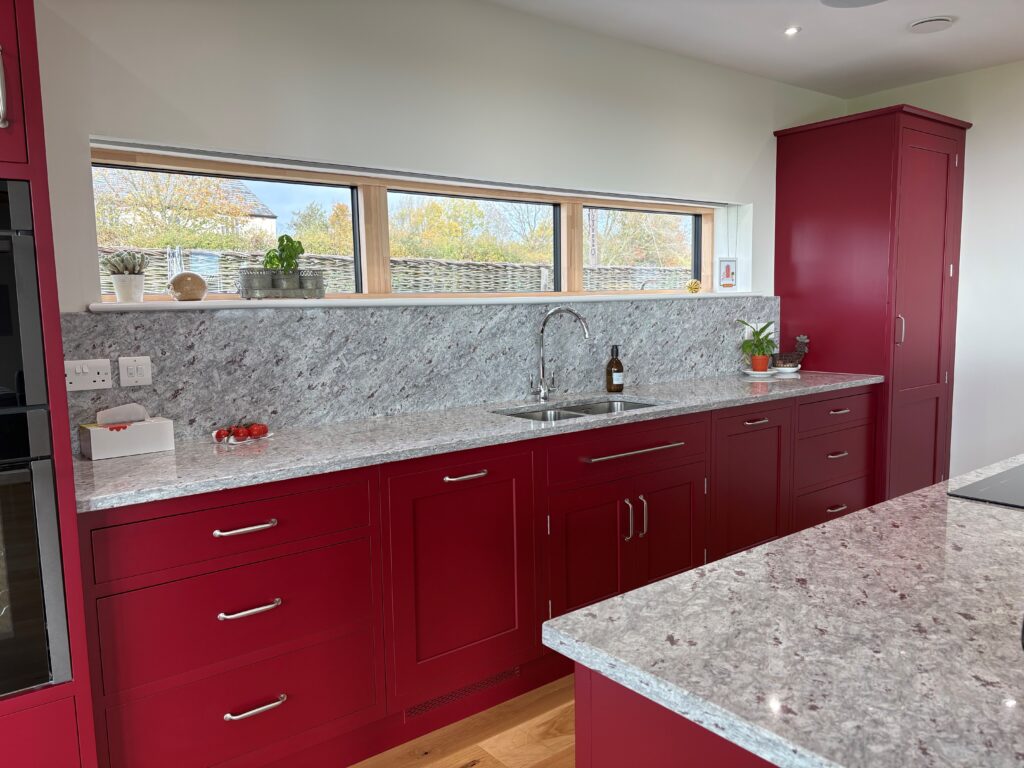
For those desiring a more dynamic and impactful look, bolder shades are increasingly making their mark. Colours like navy blue, forest green, and charcoal grey add a striking dimension to kitchens, offering depth and personality. These shades are especially well-suited to larger spaces, where they can be used without overwhelming the room. To balance out darker tones, incorporating metallic accents in copper, brass, or chrome can provide contrast and an added touch of luxury.
Pastel shades are another option gaining popularity, thanks to their ability to evoke a sense of comfort and nostalgia. Colours like soft mint, powder blue, and pale pink can inject character without overpowering the space. Pastels work particularly well in homes that embrace a vintage or retro-inspired aesthetic. By combining these hues with neutral tones or minimalist features, it’s possible to maintain a contemporary edge while softening the overall look.
Give the team at Knights Country Kitchens a call to discuss your kitchen design ideas.
